Many of you may have seen that this week, San Francisco-based, Uber unveiled a new logo for its company. Initially, it offended me and I had to get to the bottom of why this choice was made. I discovered this article which gives a very in-depth explanation about the whole rebranding process and all the research that was put into the new look.
My two biggest issues with reading that article about the design process are as follows. When I found out that Uber’s CEO wanted to rebrand as a means of “self-exploration,” I was appalled. First of all, use your “self-exploration” for yourself, not your company/the work that you do. Those two are not the same. Also, when I learned that he wanted to go ahead and design his company’s new look, although he is not a Graphic Designer, that was a red flag. People who are not trained at something, should not go ahead and do that thing. Graphic Designers exist so that they can properly design things that people will like. If you are not a trained pilot, don’t attempt to fly a plane, just because you think it will benefit yourself. That is not a smart choice.
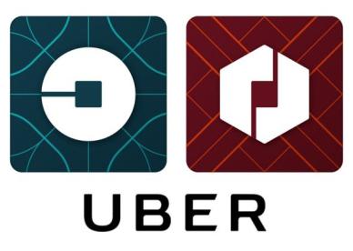
I don’t like these new logos personally. I think the rebranding is: a) unnecessary b) nonsensical c) confusing d) over-the-top e) non-unifying and f) complicated. I liked the original Uber logo because it was easy to understand, easy to see, easy to remember, and it stood out. The old logo wasn’t your typical “U” form, it showed a starting point that moved to an end point. It conveyed motion not in an obvious way, but in a sophisticated way. And sophistication was Uber’s goal from the start. Sure, Uber has moved forward with what its services so that it does not explicitly rely on exclusivity, but the old Uber logo didn’t scream classiness, rather it alluded to it. Uber’s old logo had a modern edge which showed that you don’t have to be refined to use a service that catered to the refined. It was a universally-recognized icon.
But this new logo muddles the brain. (For this review’s purpose I will focus on the rider’s logo, the circle-based logo as seen on the left of the first image.) First of all, it is confusing to look at. Should we focus on the negative or the positive space? The square in the center or the circle swallowing it? Frankly, the new logo gives me indigestion. I want the logo to be a play on the once-defining, “U” of the brand’s name. I want to be able to turn the logo on its side so that the image is also a letterform. I also want the logo to once again convey motion, yet instead it seems to show being stuck or trapped- definitely not a feeling I want to associate with this company. I feel like the idea of atoms and bits is too abstract of an idea to relate to a ride-providing service. One could argue that atoms and bits could just as “well” be applied to any other brand, in the same sort of vague explanation.

Sometimes companies feel that to stay afloat, a rebranding is the only reasonable option. There are so many ways that your company can stay relevant to its audience. Just because one person sees a new look for something, does not mean that it will work. And to those who believe that there will always be naysayers to change (you’re welcome), my argument is that if that change were really so good, perhaps everyone would truly be on board. In this case, I might go so far as to say that as an actual Graphic Designer who values good design… I’d rather take Lyft.

One thought on “Uber’s Rebranding Doesn’t Work”